- Understanding and creating KPI’s for your Start Center
- Creating Bar/Pie chart portlet for your Start Center
- Creating a result set query in Maximo
- Working with the Bulletin Board in Maximo
- Getting started with Maximo Start Centers
You can create KPI’s for your Start Center, but first we will create pie/bar charts as they are much simpler to create. You can create pie charts and bar charts from your results set queries that you should have already created. These charts basically group your query data results and show them in a visual chart instead of a list. An example of a pie chart would be when you have a query of open workorders and you want to group them by work type. You can then see how many are of type CM or PM. Let’s get started with creating a pie chart from your existing queries.
Creating a Result Set List Portlet
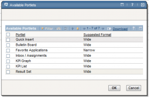
First, we need to have created a result set query in order to create a pie/bar chart. Let’s use the one in the previous post for “Open PM’s”. The first thing we can do with this query is to show a list of records in our Start Center as a list view, where each record can be clicked on to go and view the details of that record. To add a new portlet to your Start Center, click on the option to ‘Change Content/Layout’. From either the left or right column sections, click on ‘Select Content’. You will see a dialog like this with available portlets:
Click on the ‘Result Set’ and click OK. This will add it to your selected column so now you can click ‘Finish’ to go back to your Start Center. You should now see a new portlet ready to be configured. Click on the edit portlet icon on the top right ![]() . From this ‘Result Set Setup’, change your ‘Display Name’ to something better and set your ‘Rows to Display’ limit. Keep in mind, you don’t want it too high because it will impact performance when you log in. You can now pick from your existing saved queries. In our case it will be ‘Open PM’s’. Click on your saved query, and now you can select which fields you want to show. You can pick the most common ones like WONUM, DESCRIPTION, WORKTYPE, and STATUS. Just check the ones you want and click ‘Finished’ when done. You should how see something like this in your Start Center:
. From this ‘Result Set Setup’, change your ‘Display Name’ to something better and set your ‘Rows to Display’ limit. Keep in mind, you don’t want it too high because it will impact performance when you log in. You can now pick from your existing saved queries. In our case it will be ‘Open PM’s’. Click on your saved query, and now you can select which fields you want to show. You can pick the most common ones like WONUM, DESCRIPTION, WORKTYPE, and STATUS. Just check the ones you want and click ‘Finished’ when done. You should how see something like this in your Start Center:
You can also color code each record by going into the ‘Display Options’ in the Result Set Setup.
Creating a Pie/Bar Chart
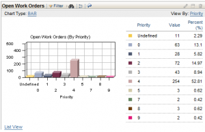
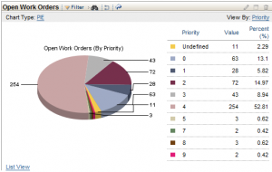
Now, creating a pie chart or bar chart from this exact same query is just as simple. Click on edit portlet icon, and how we can change our chart options. Click on the ‘Chart Options’ tab and you can see by default, the ‘Show Chart by Default?’ is unchecked. Check that box and change the ‘Chart Type’ to either BAR or PIE. Now the next important step is to determine which value do you want to group your records by from your result set query. In our example, we can group by WOPRIORITY. You can also group by WORKTYPE or something else, but make sure the value you choose has multiple records associated with it. If you choose to group by WONUM, it won’t really work, because all WONUM’s are most likely unique values in your result set. So once you choose this value, enter it into the ‘Display By’ field and click ‘Finished’.
If you chose the BAR chart, it will look something like this:

If you chose the PIE chart, it will look something like this:
So the idea of having all this information at your finger tips when you first log in to Maximo is a nice one, but be careful and don’t overdue it because it can have a negative impact on performance when you log in. I have seen start centers that are filled with so many result sets that it literally takes a user 5 minutes to log into Maximo. At first, it looks like Maximo is hanging and all you see is a white screen, but it’s actually trying to build and run all those queries.


